echarts-----柱状图
创始人
2025-05-28 07:47:13
0次
实现步骤:
* 从官方示例中找到最接近项目需求的例子,适当修改, 引入到HTML页面中
* 按照产品需求,来定制图表。
第一步:参考官方示例 + 分析
(function () {
// 1. 实例化对象
var myChart = echarts.init(document.querySelector(".bar"));
// 2. 指定配置和数据
var option = {// 工具提示tooltip: {// 触发类型  经过轴触发axis  经过轴触发itemtrigger: 'axis',// 轴触发提示才有效axisPointer: {    // 默认为直线,可选为:'line' 线效果 | 'shadow' 阴影效果       type: 'shadow'        }},// 图表边界控制grid: {// 距离 上右下左 的距离left: '3%',right: '4%',bottom: '3%',// 是否包含文本containLabel: true},// 控制x轴xAxis: [{// 使用类目,必须有data属性type: 'category',// 使用 data 中的数据设为刻度文字data: ['Mon', 'Tue', 'Wed', 'Thu', 'Fri', 'Sat', 'Sun'],// 刻度设置axisTick: {// true意思:图形在刻度中间// false意思:图形在刻度之间alignWithLabel: true}}],// 控制y轴yAxis: [{// 使用数据的值设为刻度文字type: 'value'}],// 控制x轴series: [{// 图表数据名称name: '用户统计',// 图表类型type: 'bar',// 柱子宽度barWidth: '60%',// 数据data: [10, 52, 200, 334, 390, 330, 220]}]};// 3. 把配置给实例对象myChart.setOption(option);
})();
第二步:按照需求修改
- 需求1:修改柱子的颜色
// 修改线性渐变色方式 1
color: new echarts.graphic.LinearGradient(// (x1,y1) 点到点 (x2,y2) 之间进行渐变0, 0, 0, 1,[{ offset: 0, color: '#00fffb' }, // 0 起始颜色{ offset: 1, color: '#0061ce' }  // 1 结束颜色]),
// 修改线性渐变色方式 2
color: {type: 'linear',x: 0,y: 0,x2: 0,y2: 1,colorStops: [{offset: 0, color: 'red' // 0% 处的颜色}, {offset: 1, color: 'blue' // 100% 处的颜色}],globalCoord: false // 缺省为 false
},- 需求2:提示框组件放到柱子上触发,没有阴影等效果
//提示框组件
tooltip: {trigger: 'item',// axisPointer: {            // 坐标轴指示器,坐标轴触发有效  这个模块我们此时不需要删掉即可// type: 'shadow'        // 默认为直线,可选为:'line' | 'shadow'// }
},- 需求3:修改柱形图表大小
* 饼形图修改图表大小是通过 series 对象里面的 radius
* 柱形图修改图标大小是通过 series 对象里面的 grid 对象 left right 等
* 显示网格 show: true,网格颜色是 borderColor
// 直角坐标系内绘图网格(区域)
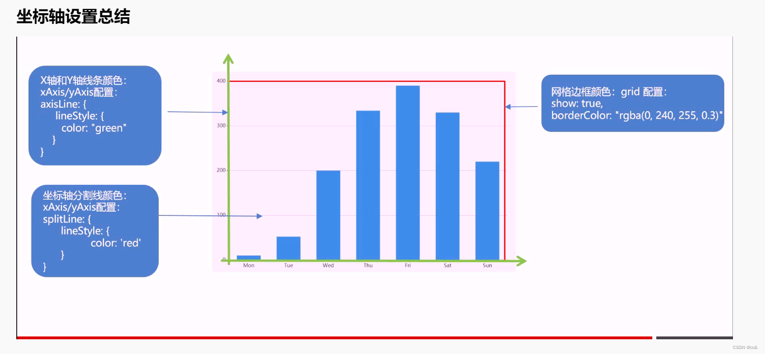
grid: {top: '3%',right: '3%',bottom: '3%',left: '0%',// 图表位置紧贴画布边缘是否显示刻度以及label文字 防止坐标轴标签溢出跟grid 区域有关系containLabel: true,// 是否显示直角坐标系网格show: true,//grid 四条边框的颜色borderColor: 'rgba(0, 240, 255, 0.3)'
},- 需求4:X轴调整
* 柱子在刻度之间
* 剔除刻度不显示
* 刻度标签文字颜色 #4c9bfd 通过 axisLabel 对象设置
* 修改x轴线的颜色 axisLine 里面的 lineStyle
// 控制x轴xAxis: [{// 使用类目,必须有data属性type: 'category',// 使用 data 中的数据设为刻度文字data: ['Mon', 'Tue', 'Wed', 'Thu', 'Fri', 'Sat', 'Sun'],// 刻度设置axisTick: {// true意思:图形和刻度居中中间// false意思:图形在刻度之间alignWithLabel: false,// 不显示刻度show: false}, // x坐标轴文字标签样式设置axisLabel: {color: '#4c9bfd'},// x坐标轴颜色设置axisLine:{lineStyle:{color:'rgba(0, 240, 255, 0.3)',// width:8, x轴线的粗细// opcity: 0, 如果不想显示x轴线 则改为 0}}}- 需求5:Y轴调整
* 剔除刻度不显示
* Y轴文字颜色 #4c9bfd 通过 axisLabel 对象设置
* Y轴分割线颜色 splitLine 对象里面 lineStyle 对象设置
// 控制y轴
yAxis: [{// 使用类目,必须有data属性type: 'category',// 使用 data 中的数据设为刻度文字data: ['Mon', 'Tue', 'Wed', 'Thu', 'Fri', 'Sat', 'Sun'],// 刻度设置axisTick: {// 不显示刻度show: false},        // y坐标轴文字标签样式设置axisLabel: {color: '#4c9bfd'},// y坐标轴颜色设置axisLine:{lineStyle:{color:'rgba(0, 240, 255, 0.3)',// width:8,  x轴线的粗细// opcity: 0,   如果不想显示x轴线 则改为 0}},// y轴 分割线的样式 splitLine: {lineStyle: {color: 'rgba(0, 240, 255, 0.3)'}}
], 
- 需求6:调整数据,与省略图形定制
// series
data: [2100,1900,1700,1560,1400,1200,1200,1200,900,750,600,480,240]
// xAxis
data: ['上海', '广州', '北京', '深圳', '合肥', '', '......', '', '杭州', '厦门', '济南', '成都', '重庆']- 省略图形(* 经过图形才显示提示,且省略的柱子不需要提;* 图形单独设置颜色)
// 中间省略的数据  准备三项
var item = {name:'',value: 1200,// 柱子颜色itemStyle: {color: '#254065'},// 鼠标经过柱子颜色emphasis: {itemStyle: {color: '#254065'}},// 工具提示隐藏tooltip: {extraCssText: 'opacity:0'},}
// series配置data选项在中使用
data: [2100,1900,1700,1560,1400,item,item,item,900,750,600,480,240], // 4. 当我们浏览器缩放的时候,图表也等比例缩放window.addEventListener("resize", function() {// 让我们的图表调用 resize这个方法myChart.resize();});完整html代码
Document
下一篇:常见的限流
相关内容
热门资讯
保存时出现了1个错误,导致这篇...
当保存文章时出现错误时,可以通过以下步骤解决问题:查看错误信息:查看错误提示信息可以帮助我们了解具体...
汇川伺服电机位置控制模式参数配...
1. 基本控制参数设置 1)设置位置控制模式 2)绝对值位置线性模...
不能访问光猫的的管理页面
光猫是现代家庭宽带网络的重要组成部分,它可以提供高速稳定的网络连接。但是,有时候我们会遇到不能访问光...
不一致的条件格式
要解决不一致的条件格式问题,可以按照以下步骤进行:确定条件格式的规则:首先,需要明确条件格式的规则是...
本地主机上的图像未显示
问题描述:在本地主机上显示图像时,图像未能正常显示。解决方法:以下是一些可能的解决方法,具体取决于问...
表格列调整大小出现问题
问题描述:表格列调整大小出现问题,无法正常调整列宽。解决方法:检查表格的布局方式是否正确。确保表格使...
表格中数据未显示
当表格中的数据未显示时,可能是由于以下几个原因导致的:HTML代码问题:检查表格的HTML代码是否正...
Android|无法访问或保存...
这个问题可能是由于权限设置不正确导致的。您需要在应用程序清单文件中添加以下代码来请求适当的权限:此外...
银河麒麟V10SP1高级服务器...
银河麒麟高级服务器操作系统简介: 银河麒麟高级服务器操作系统V10是针对企业级关键业务...
【NI Multisim 14...
目录 序言 一、工具栏 🍊1.“标准”工具栏 🍊 2.视图工具...